Back in school there was a period when we were all so very infatuated with "the creme of Manchester" and similar campaigns that we spent too much time creating visuals out of the product before coming up with any other ideas. It's so gratifying, turning teabags into tree-leafs, beer caps into crowns, beer bottle into butts. Alas, most of the the visuals you can think of have already been done, so be careful walking down this route. Sometimes you'll find the same exact visual to represent twe different ideas, like the blood splattered car window vs the economists ability to cut through the noise. Our latest example is for caffeinated drinks where the caps represent eyes. Rocket and Wink created these posters for Fritz kola, the first poster asks: Tired? The second responds: Awake! and the idea is of course the extra caffeine in Fritz cola helps you snap out of the mid-afternoon slump. This works well on two side by side billboards. 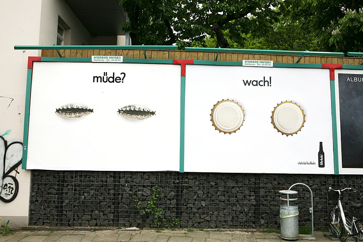 Now, that's a simple use of bottle caps to represent eyes, and so good it had to be used again - far away in Russia. The custom brewery Ural's wants you to not drink and drive, and here the two crunched caps make sense again, as two heavy beers can make you a little tired. Looks like a typical case of tired visual starting point put these two in Badland, even though their end messages are different.

I built this website. From scratch. Including the servers.
Adland® is a commercial-laden heaven and hell for advertising addicts around the world.
This advertising publication was founded in 1996, built on beer and bravery, Adland® now boasts the largest super bowl commercials collection in the world.
Adland® survives on your donations alone. You can help us out by buying us a Ko-Fi. Adland® works best in Brave browser